Aegon Pension App - UX & Research
- UX & research lead
- Research approach & frameworks
- Leading user testing
- In person interviews
- Experience mapping
- Measuring UX outcomes
- UX & research lead
- Research approach & frameworks
- Leading user testing
- In person interviews
- Experience mapping
- Measuring UX outcomes
How might we enable a human centred design process within Aegon?
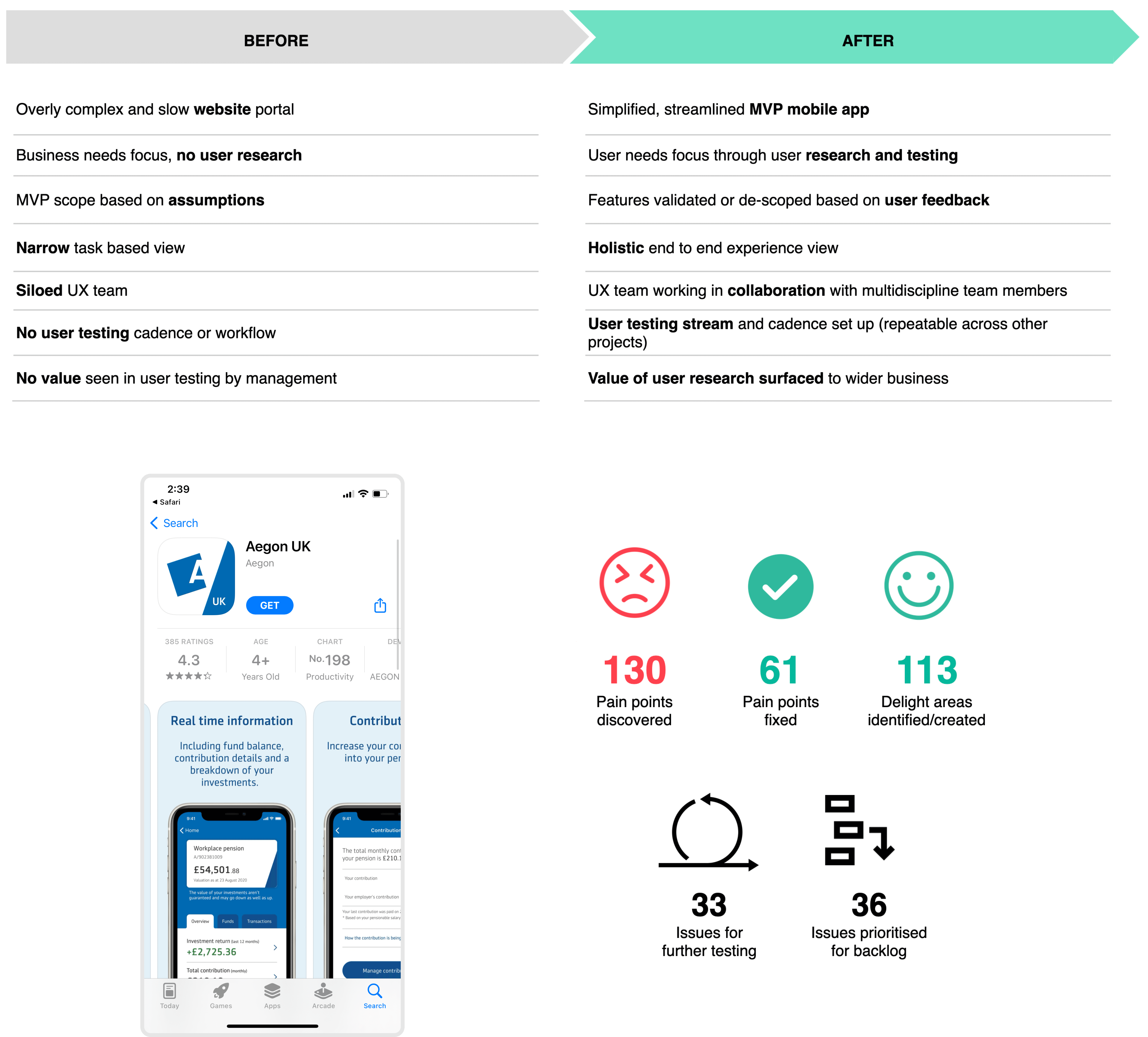
Aegon is one of the world's leading providers of life insurance, pensions and asset management. The ask was to simply help the Aegon team design and release their pension app. However this evolved into much more, when we saw that there was a lack of any user input in their design process. We ended up transforming the way they work by introducing user testing and design sprints into their agile development process.
My roleMy role originally was to oversee the UX of the app design, however I noticed that there was no input from actual Aegon customers so I decided to introduce user interviews for understanding their customers plus user testing, usability surveys and audits throughout the design and development sprints. I also created a an experience map for a visual representation of pain points and delight areas and ran live iteration workshops with stakeholders which proved the value and also centred the team around the user needs.
Shape of the team- UX & research lead (myself)
- Senior UX designer
- Senior UI designer
- Project manager
- Development lead
- Developers x 8
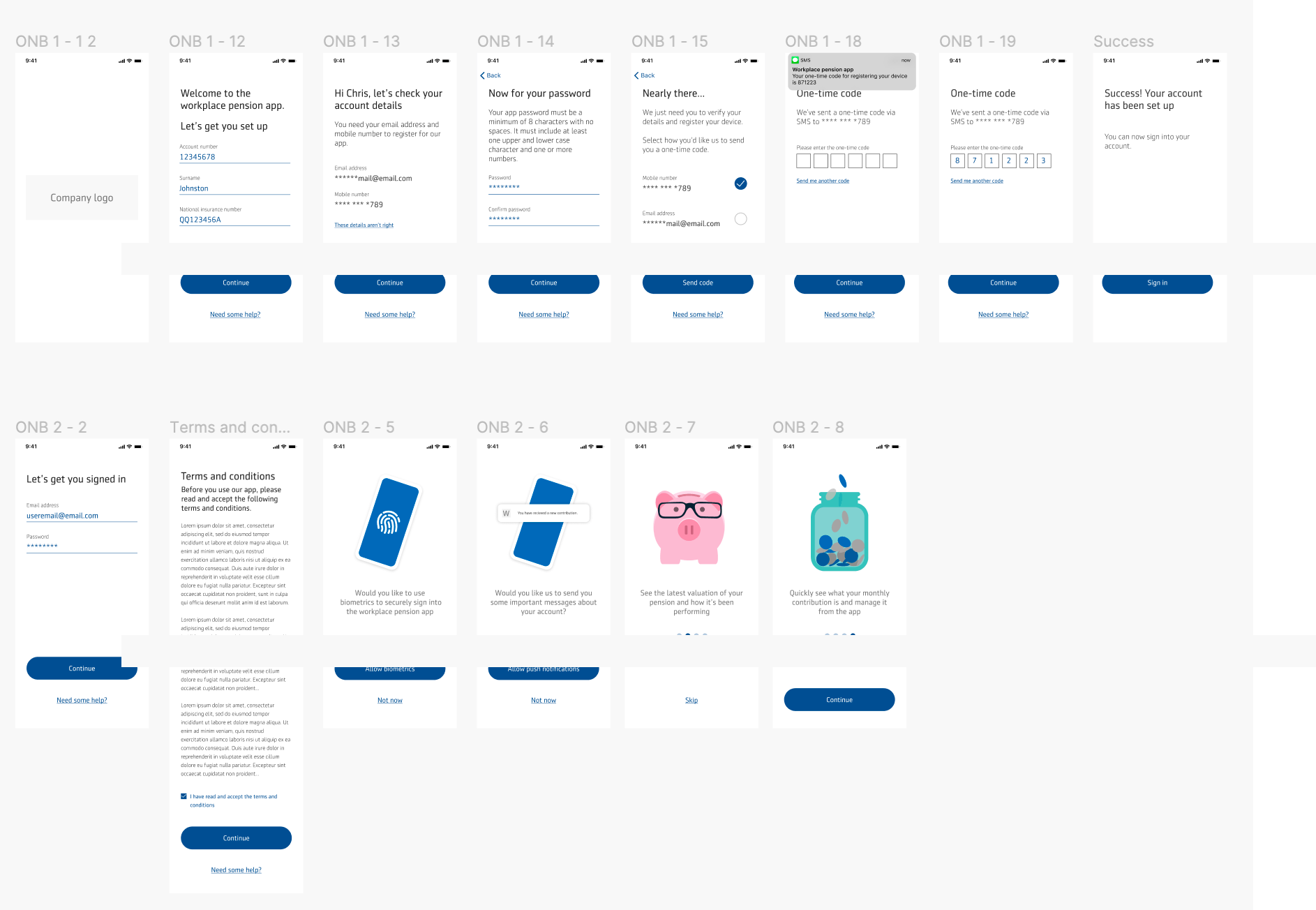
As there hadn’t been any sort of user research conducted my first though is that we need to understand the customer needs and how the current MVP design is or isn’t meeting those needs. We also needed to perform an analysis to uncover any immediate UX or usability issues and create hypothesis for testing. Then we decided to create a big customer experience map to visualise the journey and plot out the pain points, delight areas and results from user testing. This was then fed into the design process during iteration sprints.
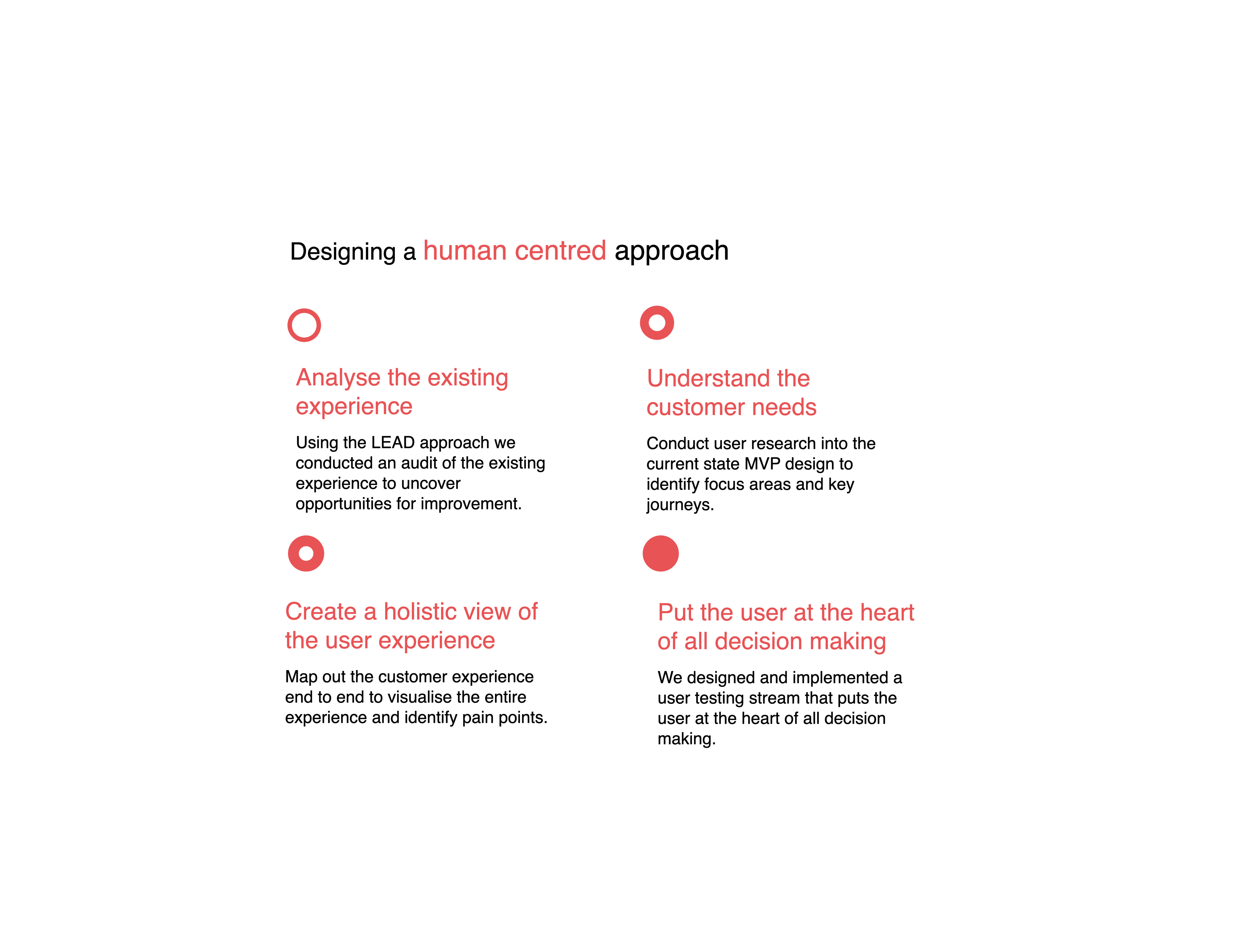
We split this into 4 key tasks:- Analyse the existing experience
- Understand the customer needs
- Create a holistic view of the user experience
- Put the user at the heart of all decision making
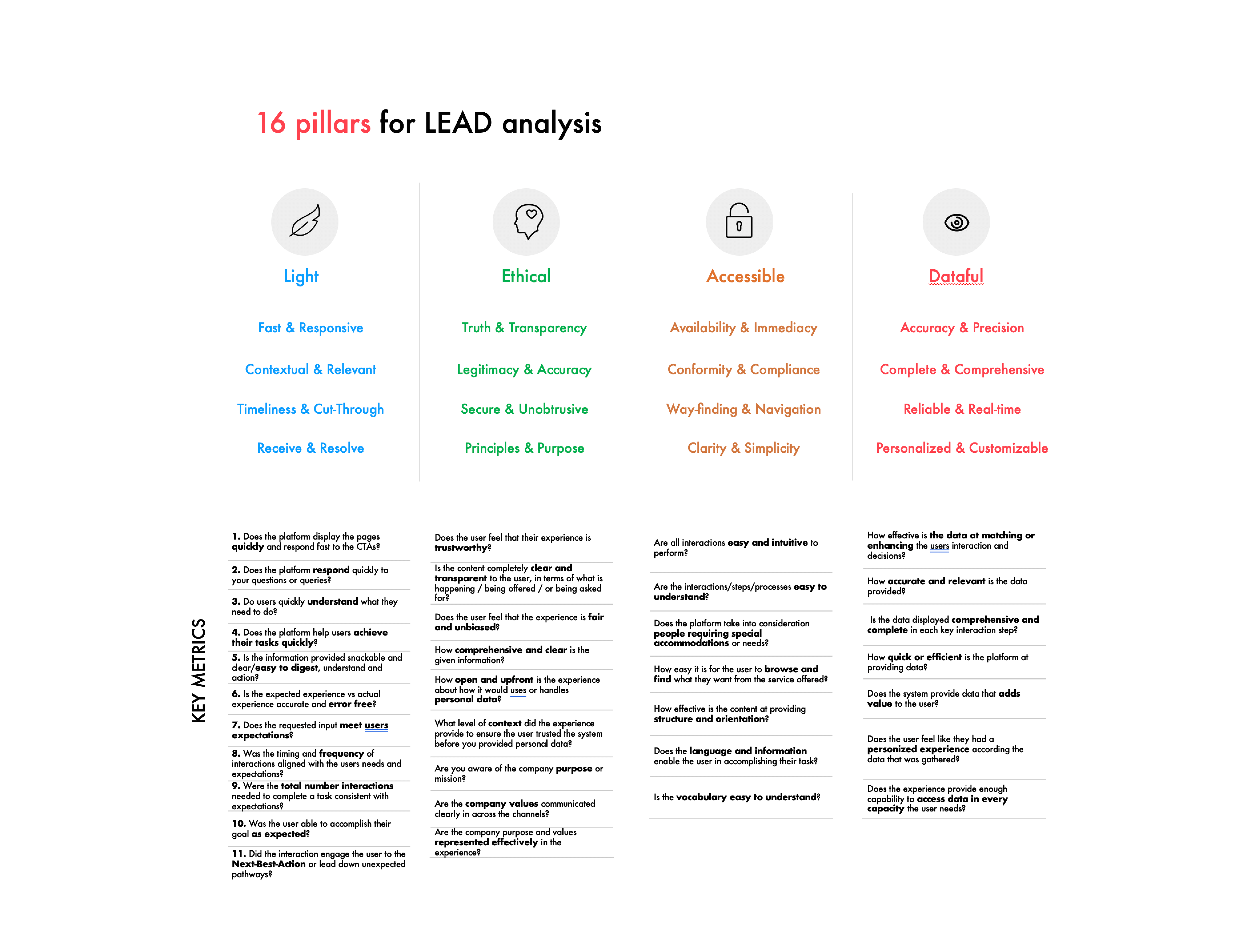
I decided to use a framework called LEAD to help us audit and measure the user experience of the app. This is a framework that was created by Publicis Sapient and is open source, you find out more about it here. Using this we could help define the goals for success as well as weave it into our sprint cadence.
In short, LEAD stands for:
Light: Light experiences are immediate. They are defined by their speed, timeliness and responsiveness to the intent and context of their audiences.
Ethical: Ethical experiences are truthful. They are open, honest and transparent. They understand the context of an audiences’ values.
Accessible: Accessible experience are frictionless. They are inclusive, embrace diversity and are consistent across all touchpoints.
Dataful: Dataful experiences are defined by their intelligence. They personalize interactions and anticipate the audiences’ situation and needs.
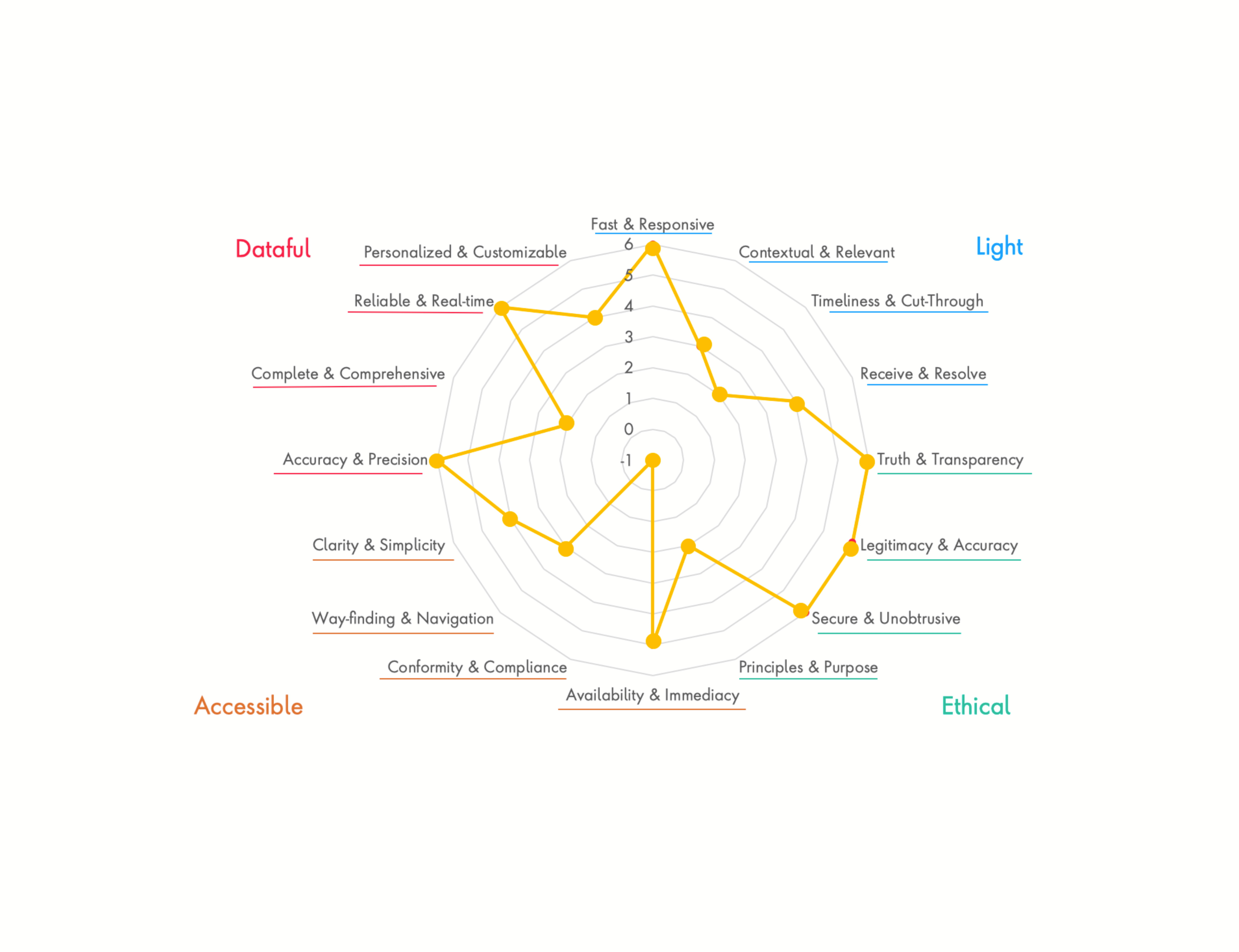
We evaluated the work done so far for the MVP and found there were some issues around unnecessary steps, data security concerns, accessibility issues, some interactions were hard to complete and it was lacking some key data points.
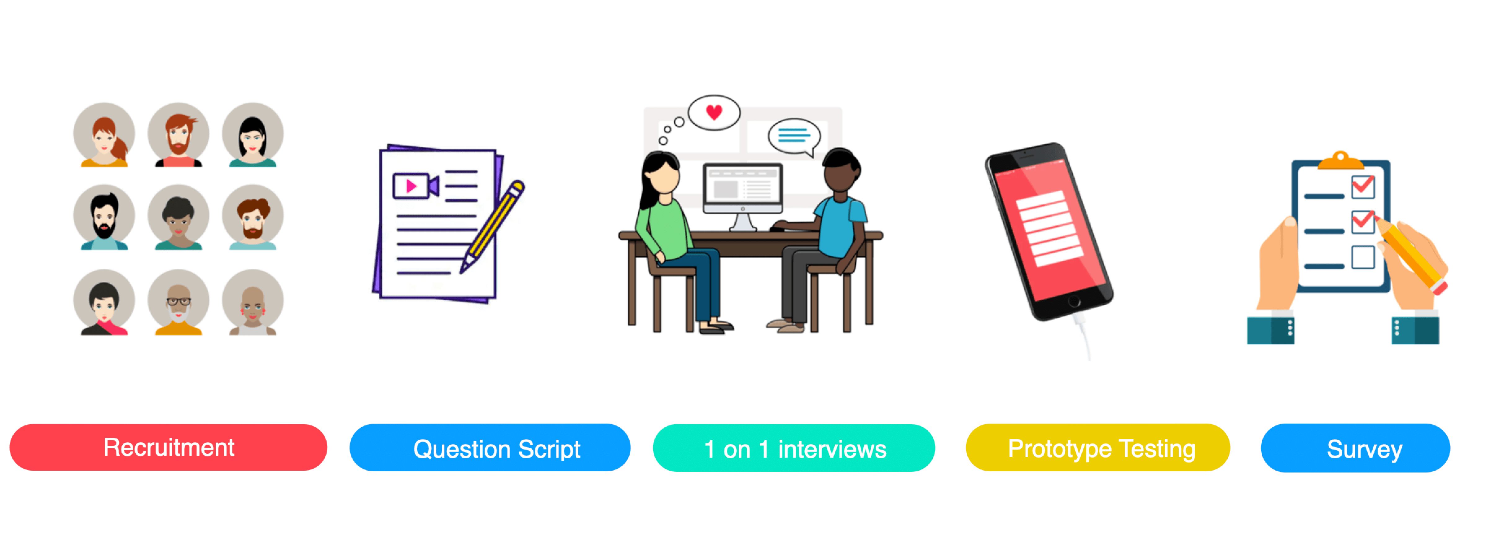
We wanted to really understand the audience we were designing for however had very little time to do so. So we decided to some generative and evaluative user testing of the proposed MVP designs.
We recruited participants that were a representative sample set of the personas demographics through the online tool ‘Askable’ which I had used at a previous agency. We only had a week before development would start so we tested with 5 participants in person with 1 on 1 interview and prototype testing.
Interview & Testing flow:Background information
- Life stage/family/living
- Finances/attitudes/habits
- Pension understanding (non sensitive)
- If they use a pension app currently
- What they use it for
- What they like/don’t like about it
Screen walk through
Step by step walk through of the flow, asking ‘why’ questions and digging deep to understand the real pains and gains behind their initial answers
Things people do
- processes, tasks, tools, problems and barriers
How they think
- goals, triggers, choices, reasons, knowledge and gaps
How they feel
- their motivations, reactions, fears and frustrations
- Overall thoughts and feelings about their experience
- What parts did they really like
- What could make it better
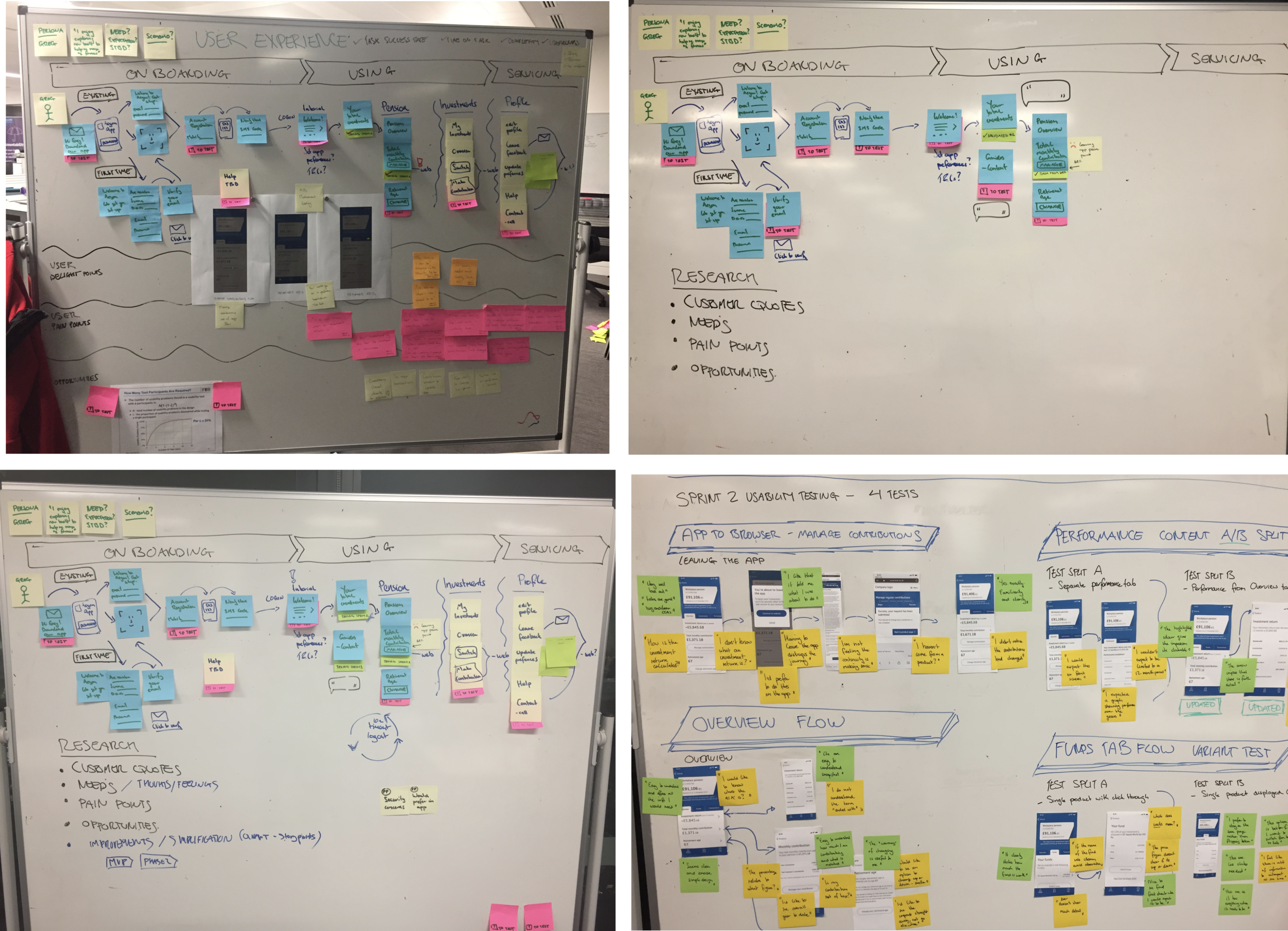
Now that we had an understanding of the full journeys I ran a workshop for everyone to contribute and collaborate, this included:
- Understanding key user journey flows
- Persona jobs to be done
- Knowledge gaps
- Hypothesis to test
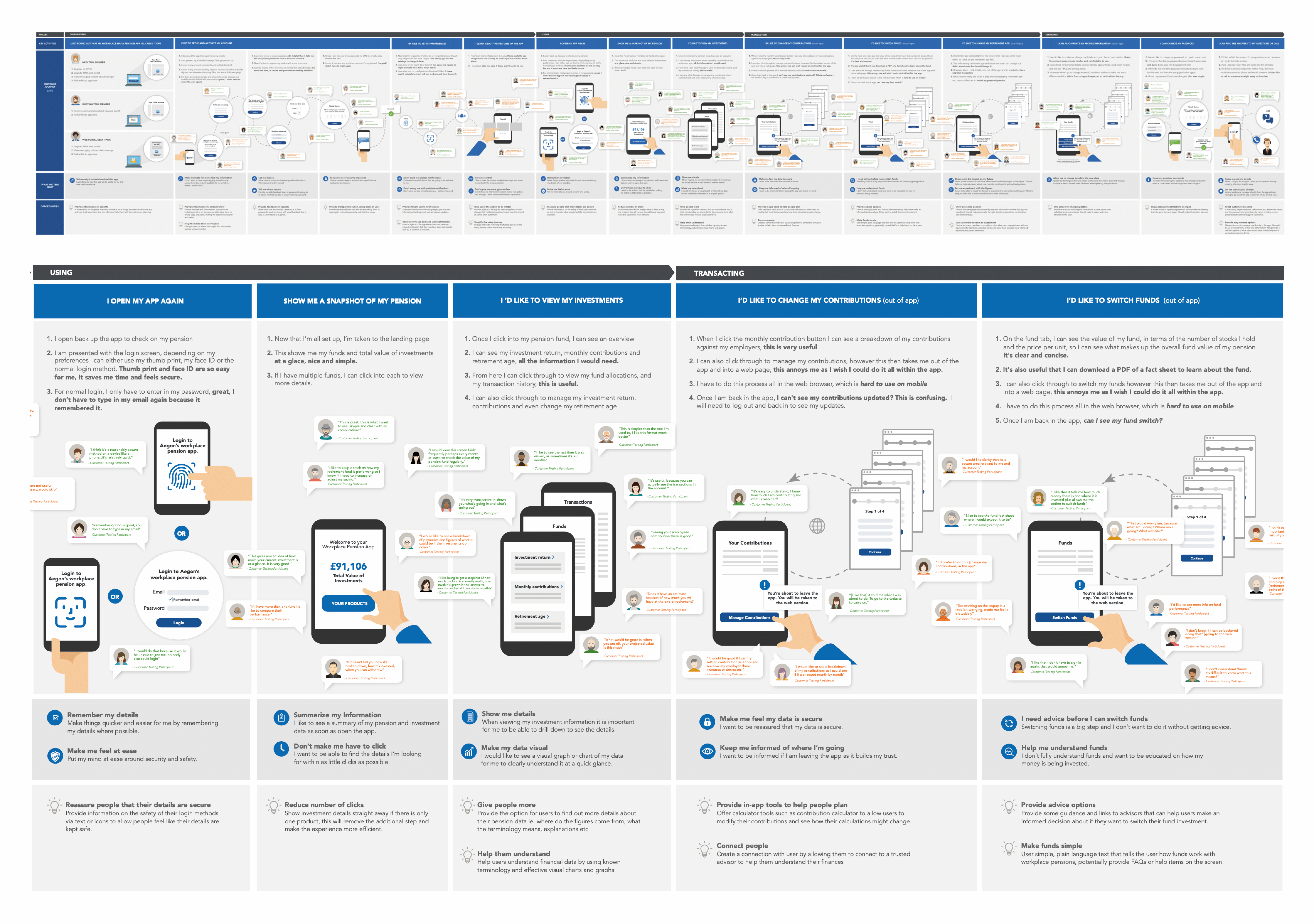
OWe wanted to something to visualise the entire journey with the feedback, so I created an experience map that focused on:
- Visualising pain points
- Visualising delight areas
- Verbatim quotes from real people
- What matters most to customers at each stage
- Identifying opportunities for improvement
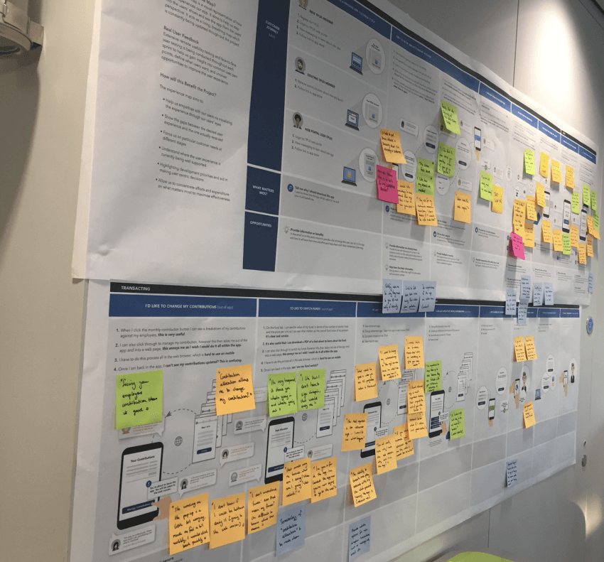
This was then displayed up on the wall in the middle of the open plan office, with a note on there encouraging people to come look and discuss. We also used post it notes every time we got more feedback to ensure it was always kept up to date and refined as we went on. We held multiple stand ups and check-ins and lightning feedback sessions around the map so that it was always the grounding us back to the customer POV when making decisions.
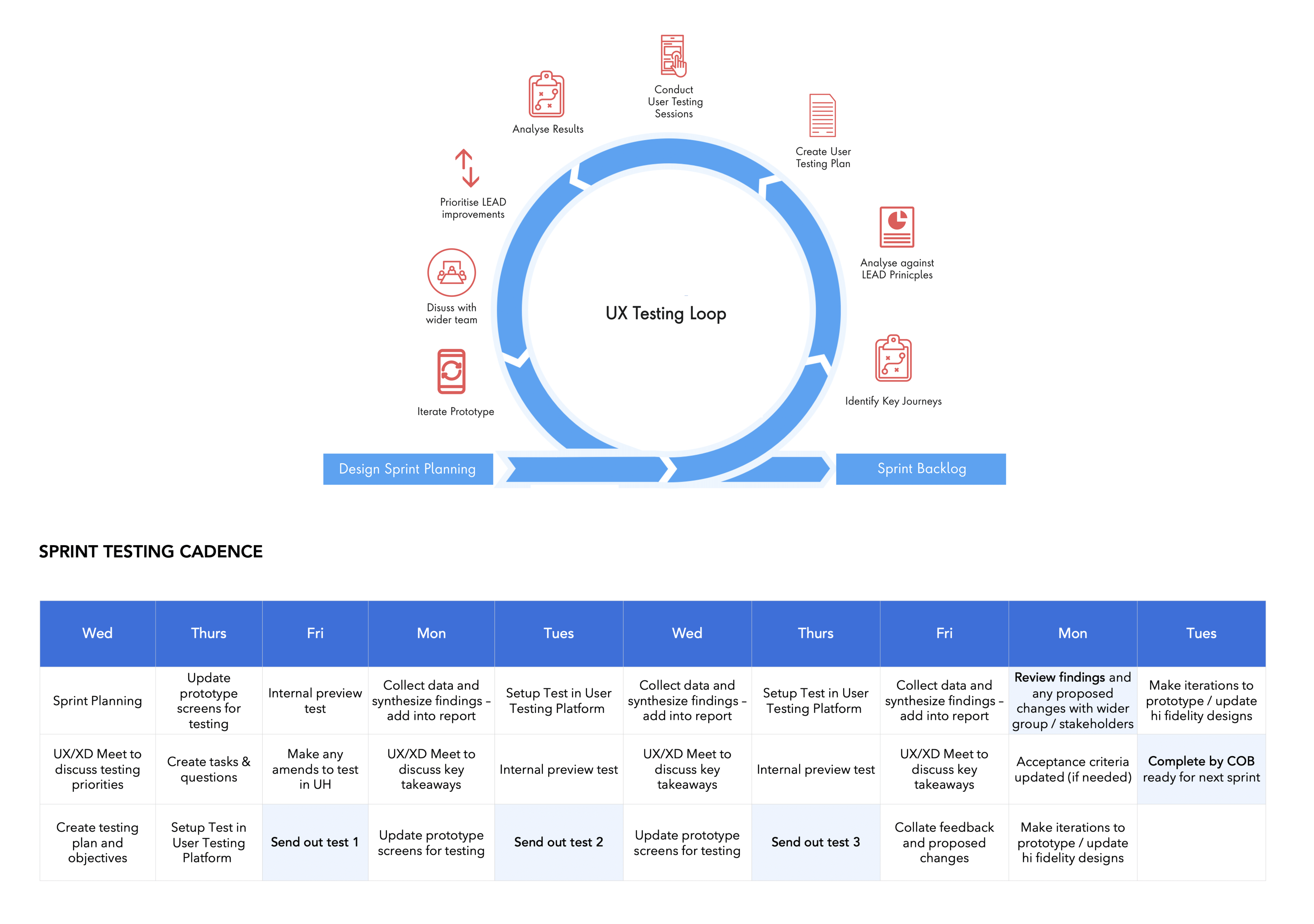
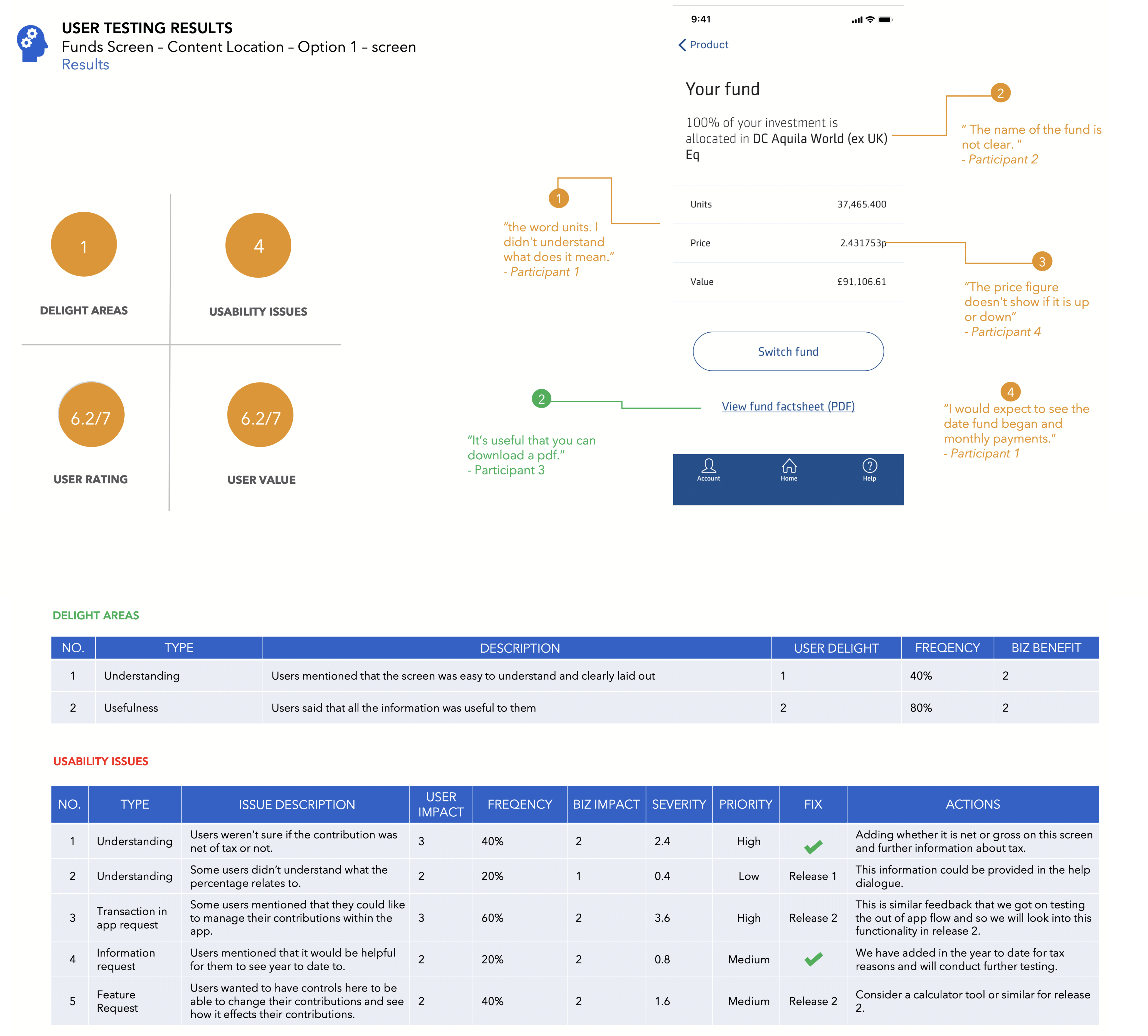
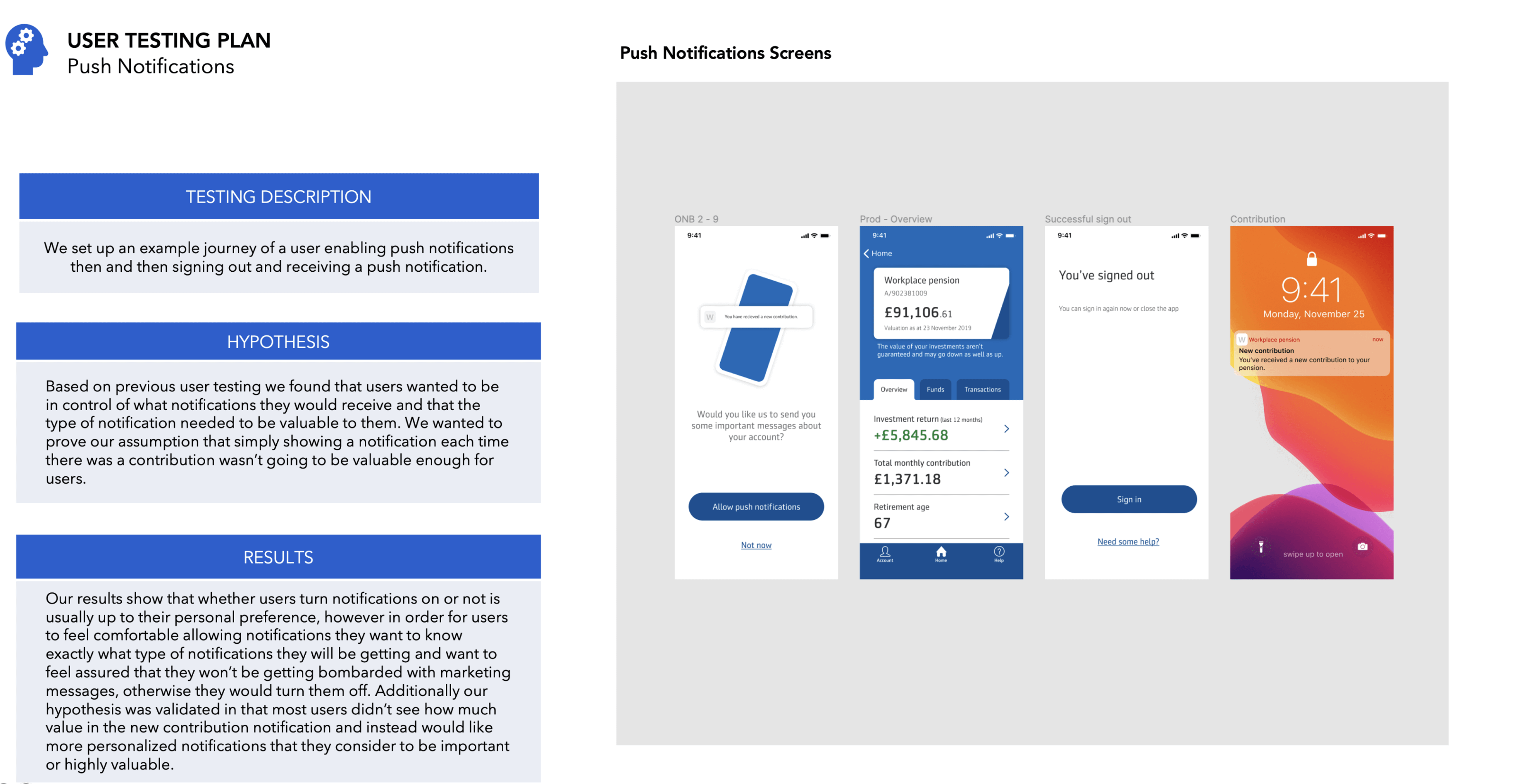
We designed a testing program to ensure that insight from evaluative testing would feed into the design and development process at a regular cadence.
Within each 2 week sprint we identify the key journeys we wanted to test, we would analyse them using the LEAD principles framework to help generate hypothesis then we would create a testing plan, send out user testing, get result back (usually within a couple hours) then analyse them and prioritise based on which ones best met our LEAD principles and against viability and feasibility and then iterate the prototype and designs.
Using the online tool usability hub, we would send out multiple rounds of testing per sprint, gathered feedback, then iterated based on the insights we got. Depending on the hypothesis we were able to understand how useful the information was, where they would click, what improvements they would make as well as an overall rating of each screen.
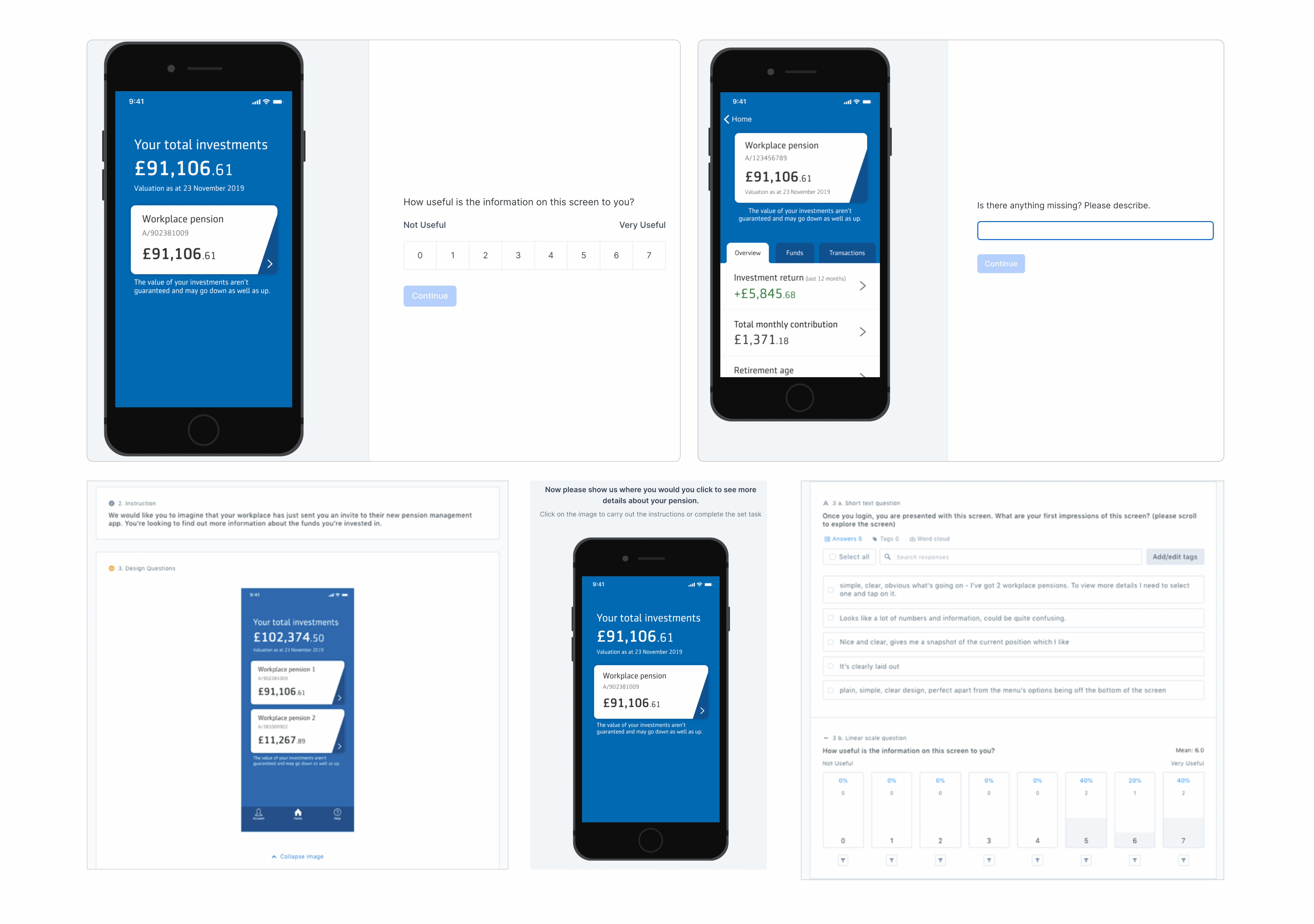
We designed a testing program to ensure that insight from evaluative testing would feed into the design and development process at a regular cadence.
Within each 2 week sprint we identify the key journeys we wanted to test, we would analyse them using the LEAD principles framework to help generate hypothesis then we would create a testing plan, send out user testing, get result back (usually within a couple hours) then analyse them and prioritise based on which ones best met our LEAD principles and against viability and feasibility and then iterate the prototype and designs.
The MVP of the app was launched and was a success with a 4.3 rating on the app store (at time of writing). Also, the new approach led to Aegon significantly improving their experience research practice and an estimate of £400K to £1M reduction in costs of the project. It also taught their team members new research skills and transformed their business to create more human-centred products and services.
